SpreeWithMe
SpreeWithMe
SpreeWithMe
Mobile App Design
Mobile App Design
Mobile Design
To comply with NDA's and PIAA's, I have omitted and redacted confidential information in my project showcase. All information in this case study is my own and does not necessarily reflect the views of SpreeWithMe
To comply with NDA's and PIAA's, I have omitted and redacted confidential information in my project showcase. All information in this case study is my own and does not necessarily reflect the views of SpreeWithMe
To comply with NDA's and PIAA's, I have omitted and redacted confidential information in my project showcase. All information in this case study is my own and does not necessarily reflect the views of SpreeWithMe
To comply with NDA's and PIAA's, I have omitted and redacted confidential information in my project showcase. All information in this case study is my own and does not necessarily reflect the views of SpreeWithMe
To comply with NDA's and PIAA's, I have omitted and redacted confidential information in my project showcase. All information in this case study is my own and does not necessarily reflect the views of SpreeWithMe
CONTEXT
CONTEXT
CONTEXT
CONTEXT
CONTEXT
SpreeWithMe is an e-commerce company that allows users to access retail discounts through group purchasing via an iOS mobile app. The vision of the company is to bring the social experience of shopping to the digital world, and help shoppers discover the benefits of their group purchasing power.
The goal was to transform online shopping into a social experience that would be as fun as shopping at the mall with your friends
PROJECT ROLE
PROJECT ROLE
PROJECT ROLE
PROJECT ROLE
PROJECT ROLE
I was the sole designer working at the company. I worked with an iOS developer as well as the product managers and co-founders to launch the app and to ensure a smooth user experience. I was also in charge of any other design related materials including marketing materials and promo banners.
I was the sole designer working at the company. I worked with an iOS developer as well as the product managers and co-founders to launch the app and to ensure a smooth user experience. I was also in charge of any other design related materials including marketing materials and promo banners.
I was the sole designer working at the company. I worked with an iOS developer as well as the product managers and co-founders to launch the app and to ensure a smooth user experience. I was also in charge of any other design related materials including marketing materials and promo banners.
I was the sole designer working at the company. I worked with an iOS developer as well as the product managers and co-founders to launch the app and to ensure a smooth user experience. I was also in charge of any other design related materials including marketing materials and promo banners.
I was the sole designer working at the company. I worked with an iOS developer as well as the product managers and co-founders to launch the app and to ensure a smooth user experience. I was also in charge of any other design related materials including marketing materials and promo banners.
CHALLENGES
CHALLENGES
CHALLENGES
CHALLENGES
CHALLENGES
SpreeWithMe was my first time designing a mobile app. My main challenge was to make sure that the designs I came up with would be able to pass the strict guidelines and be launched onto the App store, and Play store.
The core audience and target users were also females in their 20s to 40s, and fashion focused. A user segment I was unfamiliar with. I had to come up with an easy and intuitive way for users to learn group shopping, a relatively new concept in North America (at the time). The app had to also be visually appealing, and easy to use.
I had to constantly iterate and learn to effectively communicate my design ideas with my co-founders, none of whom had a background in design. This experience taught me how to implement the lean startup methodology from the ground up, and also how difficult it is to create a successful product.

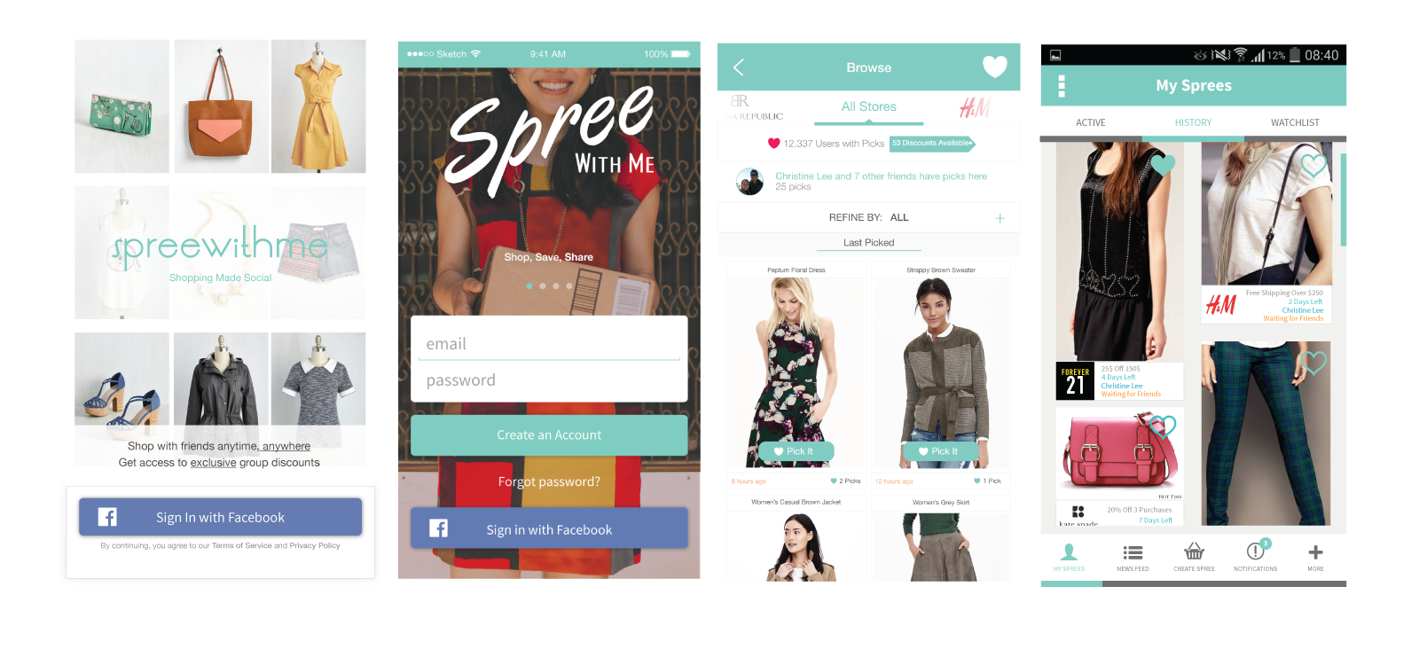
Sample Mockups of the App for Android and iOS
Sample Mockups of the App for Android and iOS
Sample Mockups of the App for Android and iOS
Sample Mockups of the App for Android and iOS
Sample Mockups of the App for Android and iOS
DESIGN PROCESS
DESIGN PROCESS
DESIGN PROCESS
DESIGN PROCESS
ANALYSIS
I worked closely with my team on the initial ideation phase, conducting user testing and interviews, and gathering constant feedback from potential customers. As the only designer on the team, I was in charge of the entire mobile UX/UI design which included creating wireframes, Invision click prototypes, typography, visual assets and design, the website, and marketing materials. Within a year, our company successfully launched a beta version of the app for further UX research and testing.
I worked closely with my team on the initial ideation phase, conducting user testing and interviews, and gathering constant feedback from potential customers. As the only designer on the team, I was in charge of the entire mobile UX/UI design which included creating wireframes, Invision click prototypes, typography, visual assets and design, the website, and marketing materials. Within a year, our company successfully launched a beta version of the app for further UX research and testing.
I worked closely with my team on the initial ideation phase, conducting user testing and interviews, and gathering constant feedback from potential customers. As the only designer on the team, I was in charge of the entire mobile UX/UI design which included creating wireframes, Invision click prototypes, typography, visual assets and design, the website, and marketing materials. Within a year, our company successfully launched a beta version of the app for further UX research and testing.
I worked closely with my team on the initial ideation phase, conducting user testing and interviews, and gathering constant feedback from potential customers. As the only designer on the team, I was in charge of the entire mobile UX/UI design which included creating wireframes, Invision click prototypes, typography, visual assets and design, the website, and marketing materials. Within a year, our company successfully launched a beta version of the app for further UX research and testing.
I worked closely with my team on the initial ideation phase, conducting user testing and interviews, and gathering constant feedback from potential customers. As the only designer on the team, I was in charge of the entire mobile UX/UI design which included creating wireframes, Invision click prototypes, typography, visual assets and design, the website, and marketing materials.
Within a year, our company successfully launched a beta version of the app for further UX research and testing.
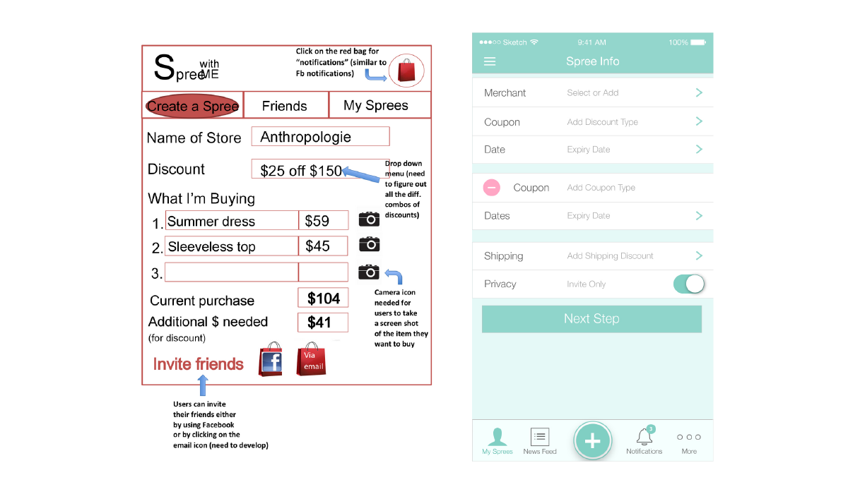
Invision Early Prototype for Testing
Invision Early Prototype for Testing
Invision Early Prototype for Testing
Invision Early Prototype for Testing
Invision Early Prototype for Testing
DEFINING THE PRODUCT
DEFINING THE PRODUCT
DEFINING THE PRODUCT
DEFINING THE PRODUCT
COMPONENT ANALYSIS
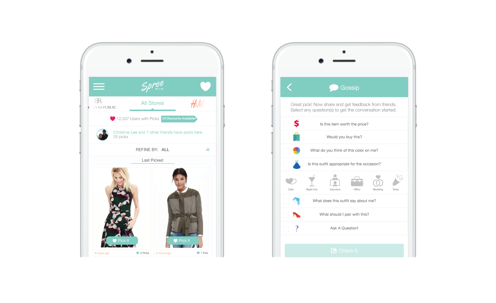
The main functions of the app are “Browse” and “Pick”. Browse is an infinite scroll/lazy load where a user can browse the items they like from different stores. Pick is when a user selects an item they like, but which they are not necessarily committed to purchasing at the moment. The more items a user picks, the better the app will be able to match the user to other shoppers as part of a "Group Spree" for greater discounts and savings.
"Check It" is a section used for opinions and reviews. We created a list of pre-determined questions, which users can ask their friends as a way to get another opinion before they commited to a purchase. The goal was to allow our users to get specific feedback from friends and family, rather than just reading the traditional star rating in most review sections.
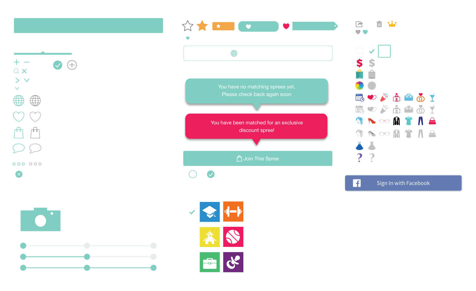
After this initial break down, I started looking at each pages on a component level through an atomic design lens. I identified different distinct elements such as— Logo, Header, Sub-header, Dropdowns, Input fields, Labels, Checkboxes, Lists, Menus, Typography, Containers, Icons and Buttons.

Browse and Pick Screens
Browse and Pick Screens
Browse and Pick Screens
Browse and Pick Screens


Initial Wireframes and Mockups & Visual Assets
Initial Wireframe Mockups & Visual Assets
Initial Wireframes and Mockups & Visual Assets
Initial Wireframes and Mockups & Visual Assets
Initial Wireframes and Mockups & Visual Assets
FINAL TAKEAWAYS
FINAL TAKEAWAYS
FINAL TAKEAWAYS
FINAL TAKEAWAYS
FINAL TAKEAWAYS
SpreeWithMe like many startups, ultimately failed to secure additional funding, even with a successful launch on the App Store. I learned a lot throughout my time there, such as failing fast, trying new things and constant iteration and testing. As proud as I am of having launched an app, that succeeded in what we set out to do, good design didn't necessarily mean that the product will be successful.
As important as good design might be, it was only a small part of the overall process. Understanding the business, finance and other logistics of the company was equally important. Design isn't done in silos afterall.
SpreeWithMe like many startups, ultimately failed to secure additional funding, even with a successful launch on the App Store. I learned a lot throughout my time there, such as failing fast, trying new things and constant iteration and testing.
As proud as I am of having launched an app, that succeeded in what we set out to do, good design didn't necessarily mean that the product will be successful.
As important as good design might be, it was only a small part of the overall process. Understanding the business, finance and other logistics of the company was equally important. Design isn't done in silos afterall.